Krolik as it core has a mission to not shy from the color in our interiors and to open up for more bold and authentic color choice. Through this short texts and illustration I hope to inspire you enough to dream and realise your wildest interior vision.
Color has always playeda crucial role in my life.
My full appreciation for bright, vivid tones came later, but even as a teenager, I used black to express the rebellious spirit I felt at the time. Now, I use color very intentionally in my work – to transport myself into emotions, places, and corners of imagination, bringing them to life and sharing them with anyone willing to immerse themselves in that world.
Today, I’d like to take you on a short journey to explore my favorite colors and how they can influence the interior of your home – or your client’s.
"Królik as it core has a mission to not shy from the color in our interiors and to open up for more bold and authentic color choice. Through this short texts and illustration I hope to inspire you enough to realise your wildest interior vision and to convince your client to follow."
Aleksandra Żeromska
Królik Creative Director
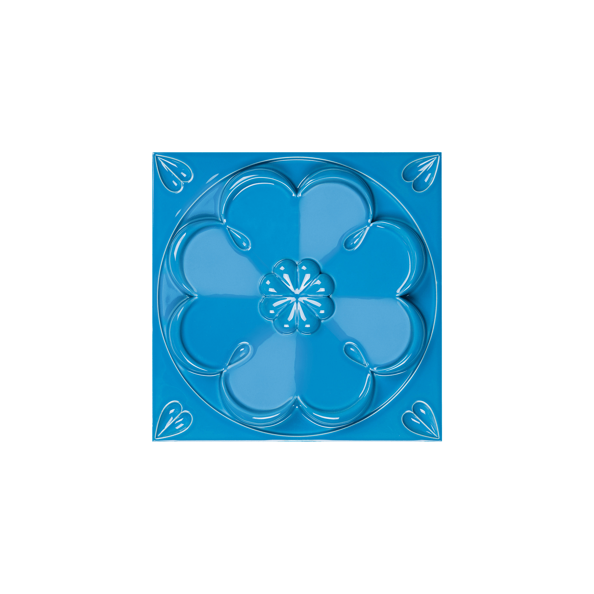
Vibrant green
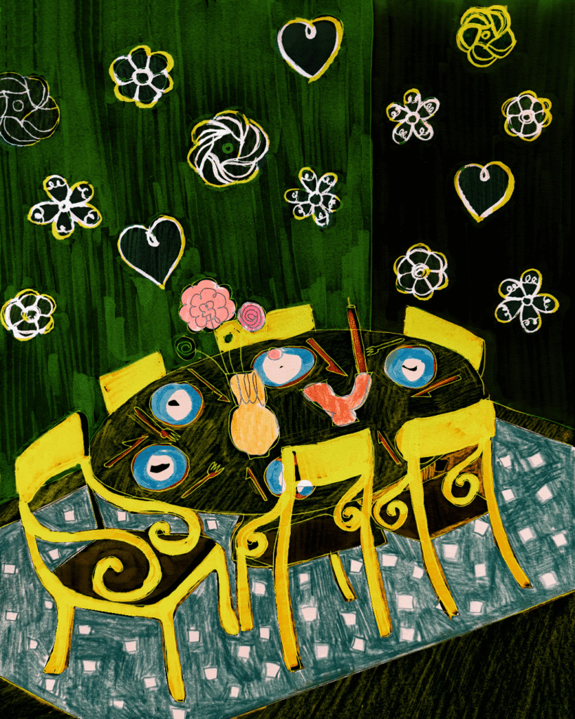
The color green has always reminded me of nature. It can be soothing and peaceful – or wild and vibrant, like a jungle. You choose the style that speaks to you. In color theory, green is considered one of the most pleasant and balanced hues. It’s easy on the eyes and calming to be around. It often evokes feelings of serenity, hope, abundance, and the powerful force of life. On a spiritual level, green is connected with growth, healing, and renewal. In Japan, it’s a symbol of new life.
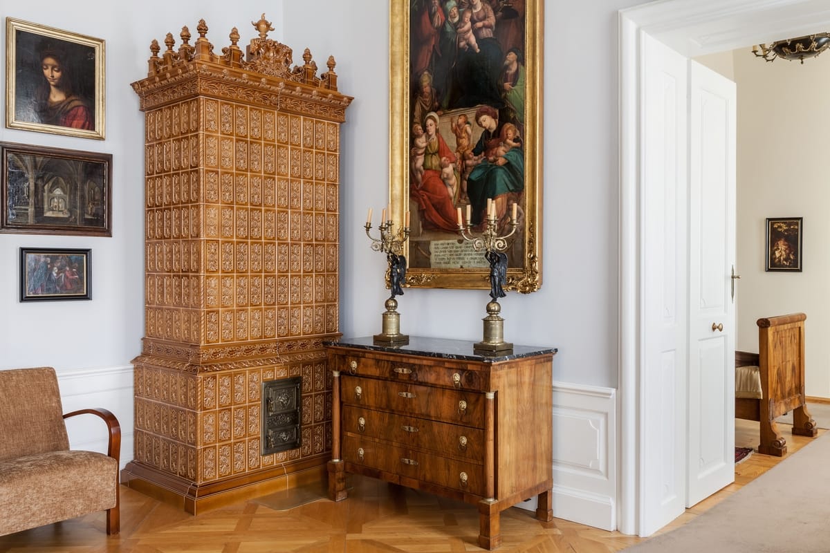
Darker shades transport us into the world of precious stones, which is why green also carries associations with luxury and elegance in interior design.
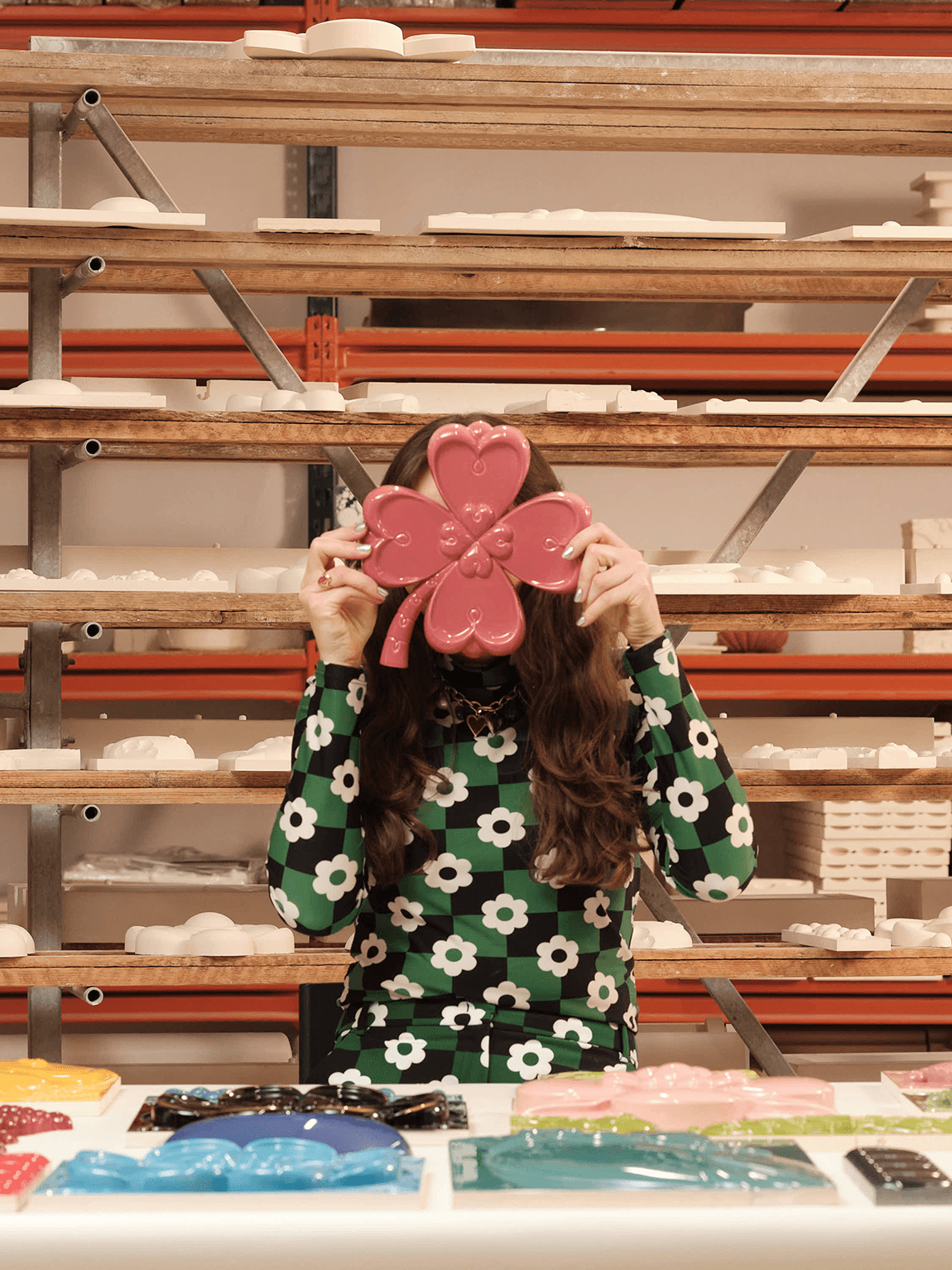
Symbolically, green quickly brings to mind the classic emblem of luck, the four – leaf clover. I even used this symbol in our “Happiness” Collection. After all, who couldn’t use a little more luck at home?
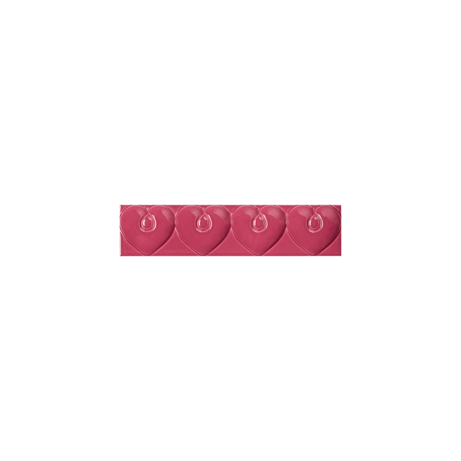
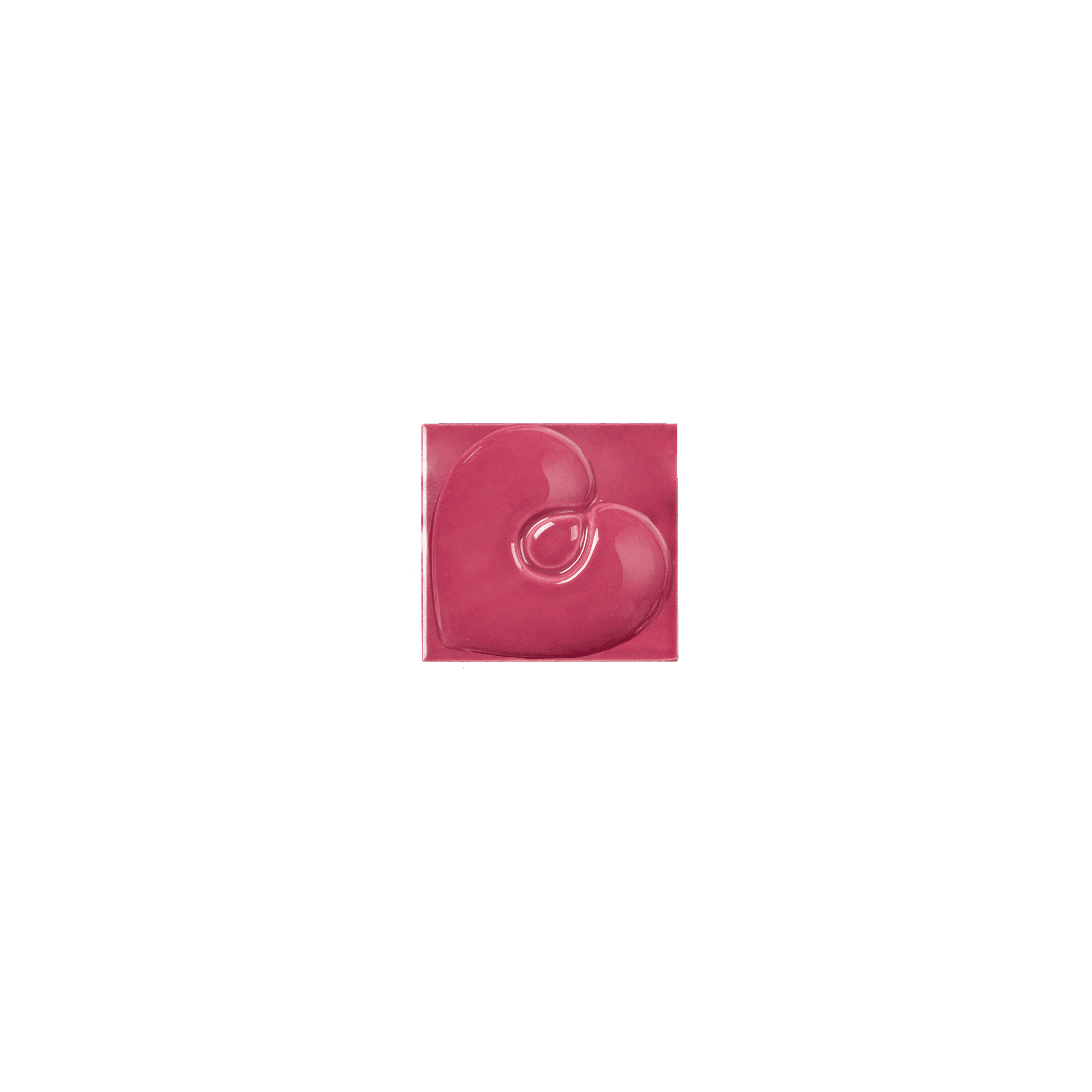
Harmony in red room
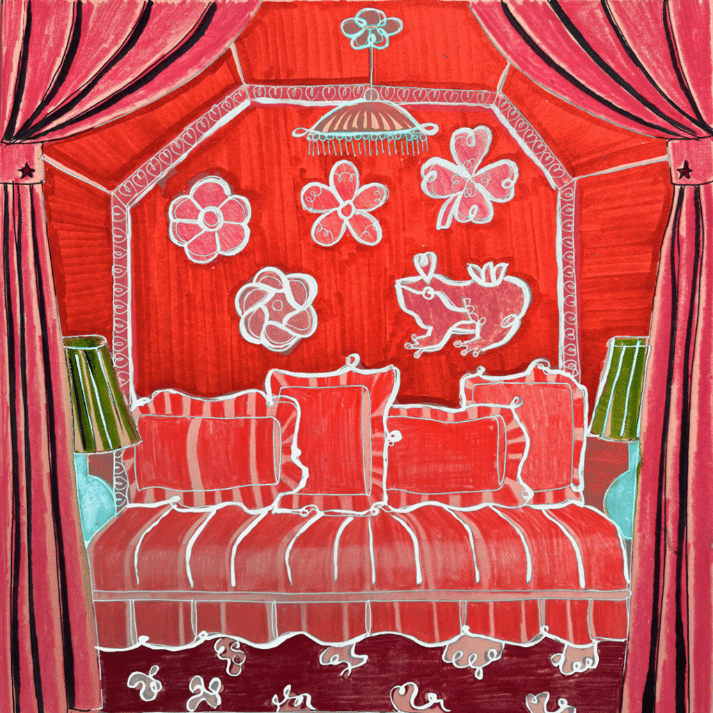
Red is a color with a very special meaning. It symbolizes passion, power, and strength. As the warmest of all colors, it carries intense emotion.
Red is dynamic and can trigger change, stirring things up in both subtle and bold ways. If you’re looking to infuse fresh, powerful energy into your home, red might just be the color to consider – but be prepared for its impact! In interior design, it’s important to remember that red walls can make a room feel smaller, but this can also create a more intimate atmosphere.
Spiritually, red represents love and deep connections with others. It draws attention to the space and the memories shared there with loved ones. So, the question is: are you ready to embrace a red space in your home?
Purple authority
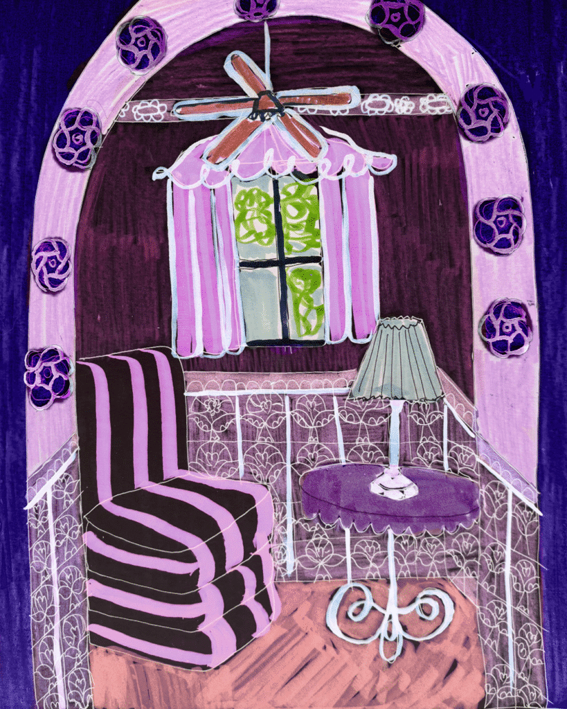
Historically, purple was a very rare and expensive color, which is why it became associated with power, royalty, and hierarchy. The reason for this? It’s price. Believe it or not, purple was created from the shell of a sea snail – how poetic is that?
Less poetic, though, is the fact that it took 12,000 snails to produce just one gram of dye… Known as the imperial color, purple was worn by Roman emperors and senators to reinforce their status. No wonder that, to this day, this color is linked with luxury, respect, and all the sophisticated things.
What’s beautiful about purple is that it combines the calming energy of blue with the strong energy of red, making it a color of equilibrium. For me, purple always brings to mind a spiritual connection. Symbolically, it represents inner wisdom, connection to the divine, and the depths of the soul.
At the end of the day, it’s a color of creativity – a color that stimulates the imagination. No wonder I was always drawn to it.
Mediterranean Citrus Orange
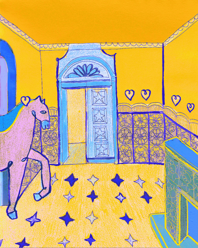
Living in Spain, the Mediterranean spirit accompanies me daily – the vibrant sun reflected in the blue sea, the warmth of long summers, and the sight of oranges on the trees in winter.
The word orange has its roots in the ancient term “naranga”, meaning “fragrance”. Instantly, it brings to mind that tangy citrus scent, and just before the trees bloom with azahar flowers ,my favorite time of year, it fills the air with anticipation. Like the taste of any citrus fruit, orange is energetic and instantly awakening.
But don’t be fooled, it carries deeper meanings, too. In ancient times, the pigment for orange was derived from a mineral called “orpiment”, believed to play a role in the process of creating gold. This gave the color a magical, imaginative quality. In Buddhism, orange symbolizes the purifying power of flame. It’s a sacred color, seen in the robes of monks, representing transformation and spiritual dedication.
When it comes to color combinations, orange enhances blue. Placing them side by side makes both appear more vibrant and alive.
Harmony in red room
We’re excited to share one of our favorite interviews featuring our Creative Director and designer, Aleksandra Żeromska. In this conversation, she beautifully expresses the vision that not only defines her personal creative journey but also deeply informs the identity of the Królik brand. We’re incredibly proud to be part of this meaningful talk and to see the heart of our brand reflected in her words.
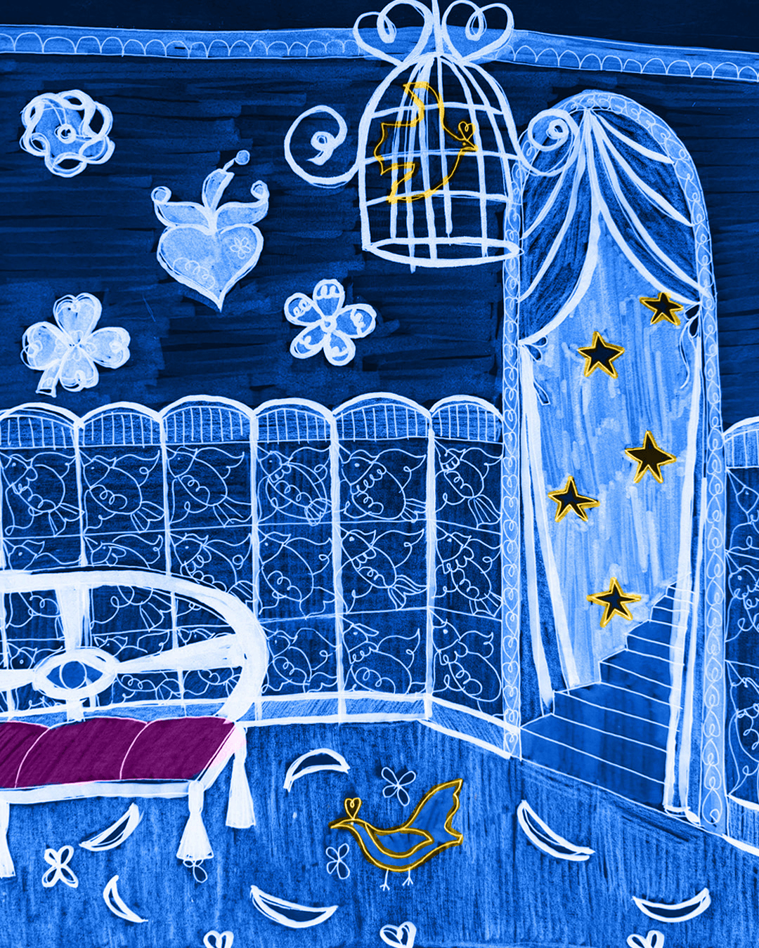
Ultramarine is my favorite color, it instantly connects me with the world of imagination – everything that is magical, mystical, and beyond this reality
Ultramarine is my favorite color, it instantly connects me with the world of imagination – everything that is magical, mystical, and beyond this reality
Ultramarine is my favorite color, it instantly connects me with the world of imagination – everything that is magical, mystical, and beyond this reality
Ultramarine is my favorite color, it instantly connects me with the world of imagination – everything that is magical, mystical, and beyond this reality
Ultramarine room – Królik signature color
Ultramarine is my favorite color, it instantly connects me with the world of imagination – everything that is magical, mystical, and beyond this reality.
To me, it is also the most poetic color, which is why we chose it as Królik’s signature color. When I first learned that the name comes from the Latin “ultramarinus”, meaning „beyond the sea,” I immediately understood why it is the color of my dreams.
The name literally refers to the origin of the semi-precious stone lapis lazuli, mined from the mountains of Afghanistan.
This unique blue was once so rare and valuable that it was considered more precious than gold in Renaissance Europe. Symbolically, it connects us to another world – far into the realm of imagination. Ultramarine has always been the color of artists – worn by kings and religious figures in iconic artwork by Michelangelo and Vermeer, and later redefined as International Klein Blue by Yves Klein.
There is no more beautiful or meaningful color. We hope that Królik will always bring the values of imagination and artistic sensibility into your homes. Are you ready to create your dream interiors? I know I am!